Newsletters
January 2014
|
Bring out your
Spring colours
Celebrate the new season with colour! Whether you make a statement wearing a head-to-toe colour,
or bring different shades together, you'll be spot on trend.
|
|
Blue is You
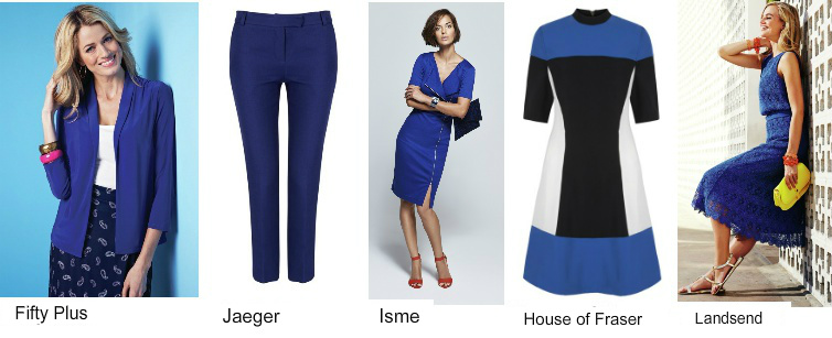
This season's blues
are varying shades
of cobalt and royal
blue. The
more vibrant shades
are best on Cools,
Clears and Deeps
but Warms, Softs
and Lights will wear
their blues in
lighter and softer
versions (think
Cornflower,
Sapphire and even
Aqua). Softer,
muted fabrics will
help tone it down
(jersey, lace etc.).
Blue is a great
colour as a wardrobe
staple - it is bold
enough to make a
statement on it's
own or you can wear
it as you would your
neutral shades
(black, grey,
browns, navy,
etc.). Once you
have identified your
best blue you can
bring in other
colours to make it
YOU.
|
|
Pink Inc.
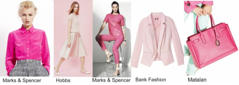
From soft pastels to
fuchsia, not
forgetting this
year's Pantone
Colour of the Year -
Radiant Orchid -
pink is still THE
colour of the
season. Hot
pink evokes drama
and glamour and is
best suited to Cool
colourings or Deep
or Clear colourings
with cool skin
tones. Blush pink
in a key piece or
top-to-toe can be a
statement look too.
It is a great shade
on all colouring
(aka a universal
colour!). The
delicate pastel
pinks are made for
the Lights but can
be mixed with bolder
pinks for those that
can. A pastel
pink in shiny fabric
will turn a simple
garment into
something more
special. Warms
should go for more
corally shades of
pink (think
orange-pinks). And
remember you can
always wear pink in
your accessories.
|
|
Hello Yellow
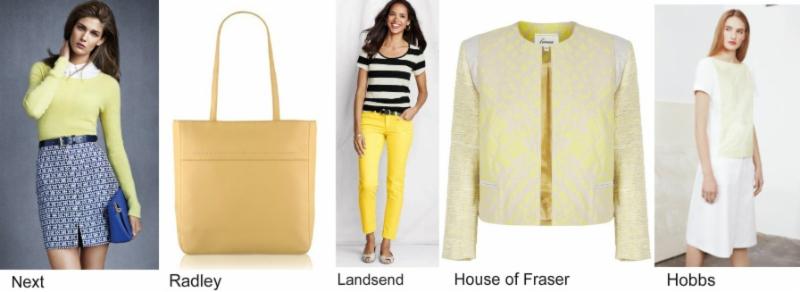
Are you ready for
some sunshine? It's
a sunny, feel-good
colour but you need
to get just the
right shade for you
and have the
confidence to wear
it. It
is a warm colour so
it won't compliment
Cool colourings or
anyone with a cool
skin tone (if you
love it though, wear
it as part of a
print, or in
accessories). The
bold yellows are
best for Warms as
well as Deeps and
Clears with warm
skin tones. Mix
your yellows with
other shades in your
palette. The Warms
can wear it with
browns, orange reds
and even lime. The
Deeps with Olive or
Burgundy; whilst the
Clears can mix their
yellow with their
blues and greens -
there are plenty
more ways to wear
your yellows, so
don't be shy. The
pastel shades are
good for Softs and
they can make it
look softer still by
mixing their yellow
with neutral greys
or taupes. Pale
primrose looks fresh
as a daisy on Lights
and mixed with white
will look
beautifully crisp
for Spring. Soft
textured materials
will tone it down
|
|
 |
Please feel free to forward the e-mail to friends, family
and colleagues who might be interested in my services. To
find out more about my catalogue and services visit
www.suepattinson.com.
If you are not the original addressee for this email, but
would like to receive my newsletter, send an e-mail at sue@suepattinson.com with
your name, e-mail address and the word "susbscribe"
or just call me on 01242 515415
to discuss my many
options and consultations

To unsubscribe, please
click here
|
|
 |
|
News
|